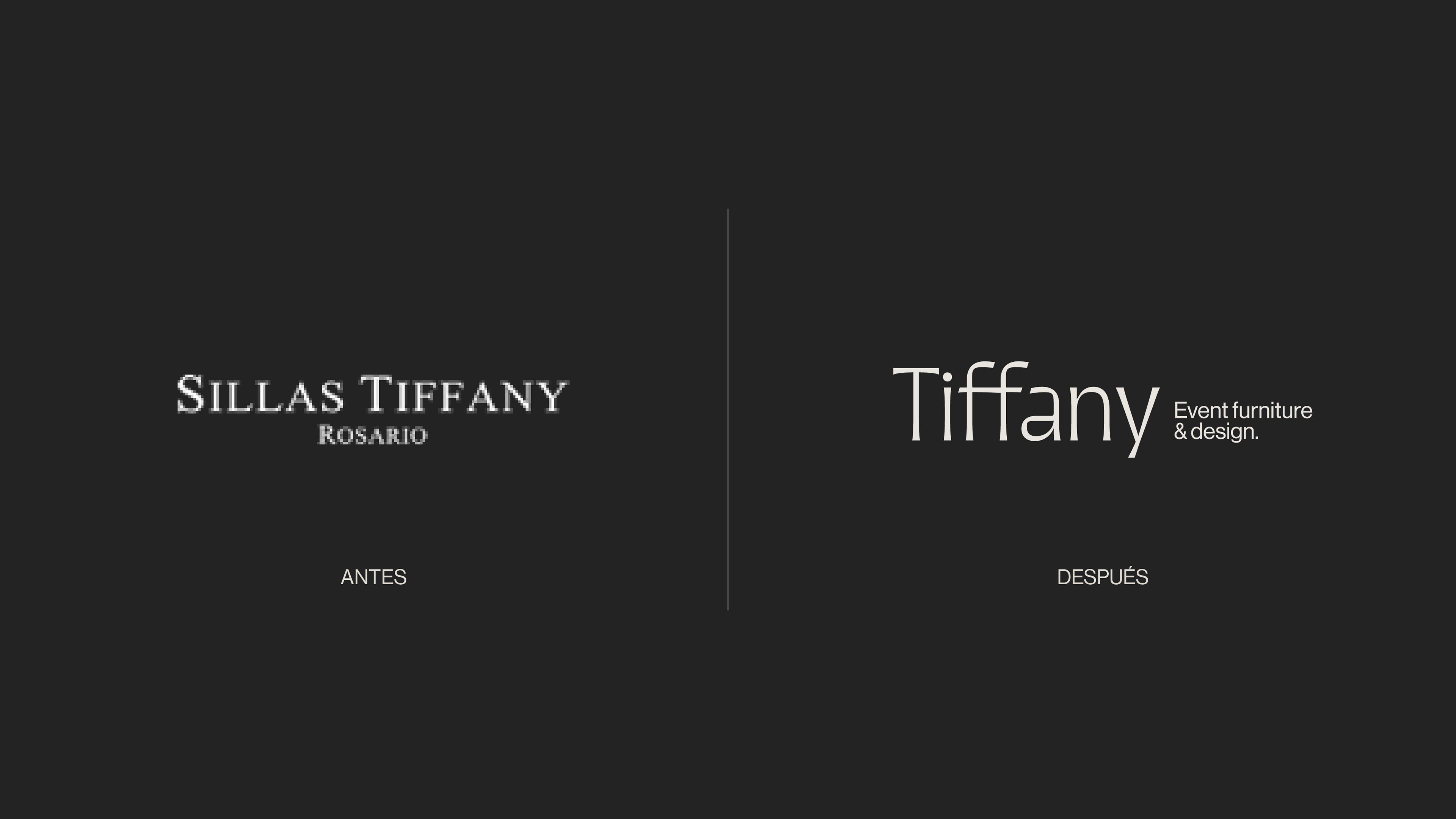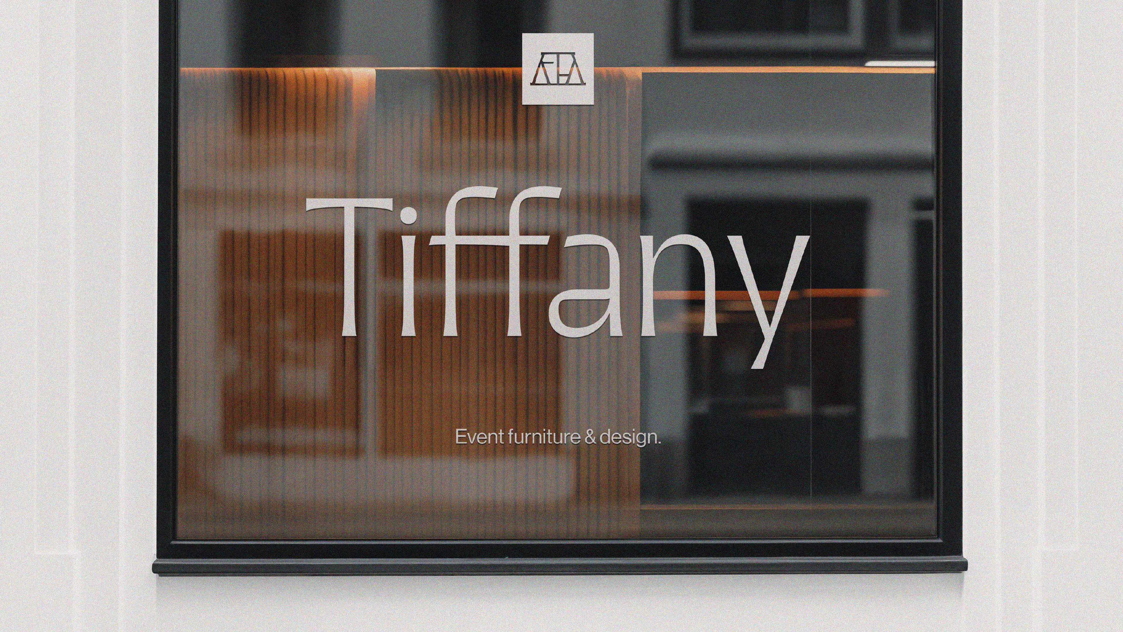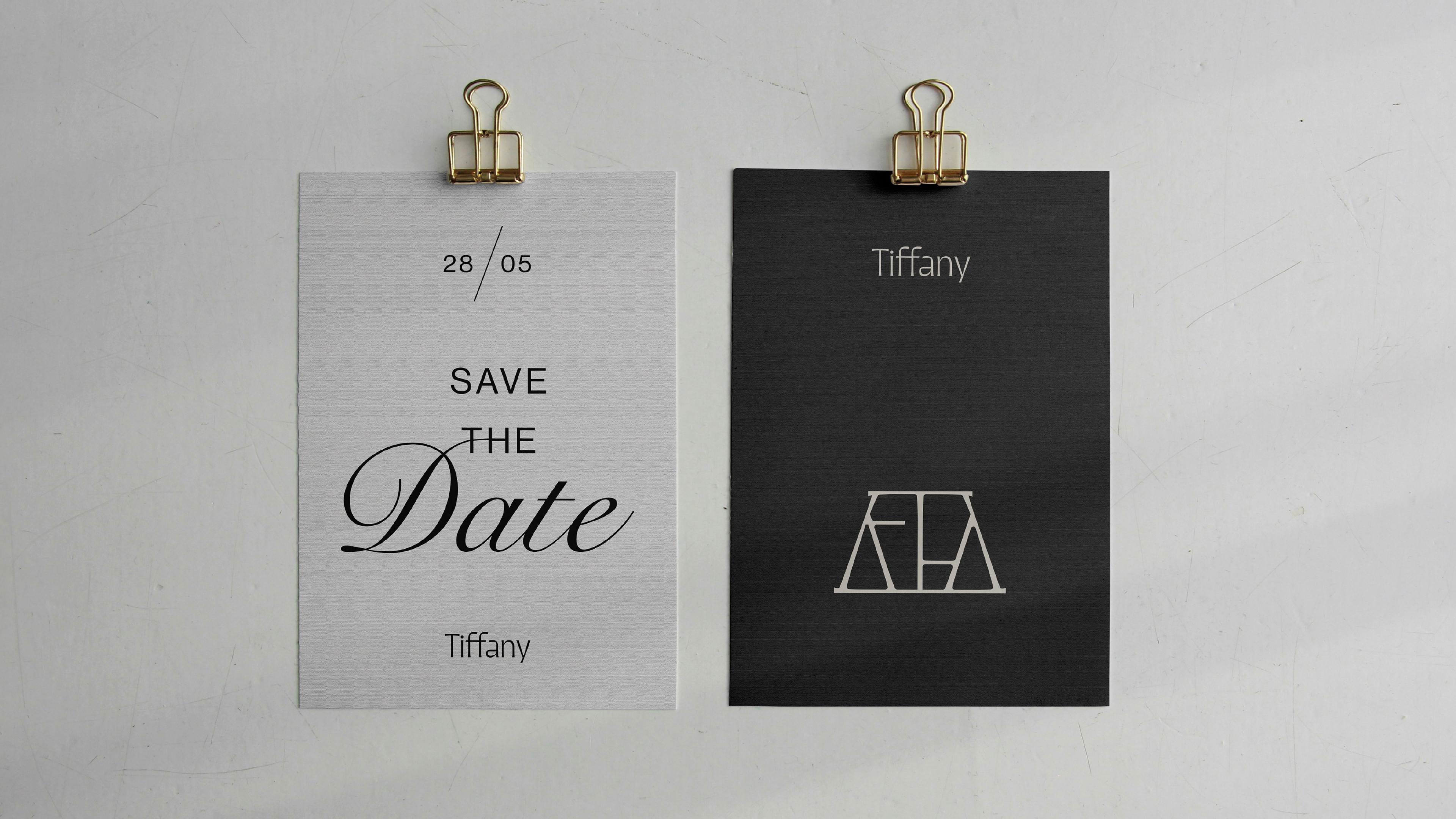
The typographic choice stems from a strategic decision: to update the brand without losing its essence, preserving its formal and institutional character while bringing it into a more contemporary language. A sans serif typeface was selected, featuring subtle gestures in its curves and terminals that indirectly evoke a more classic style, creating a bridge between past and present.
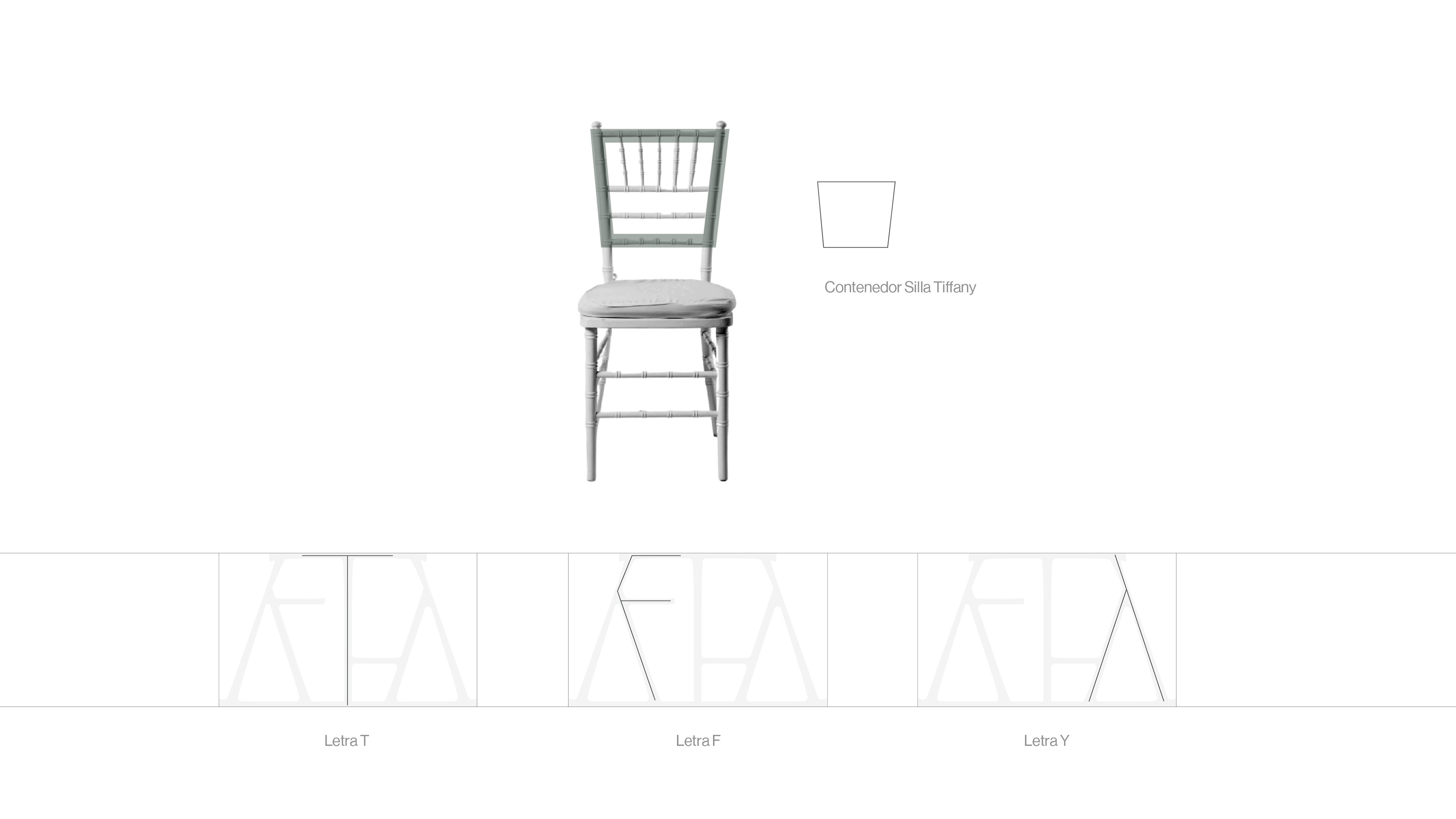
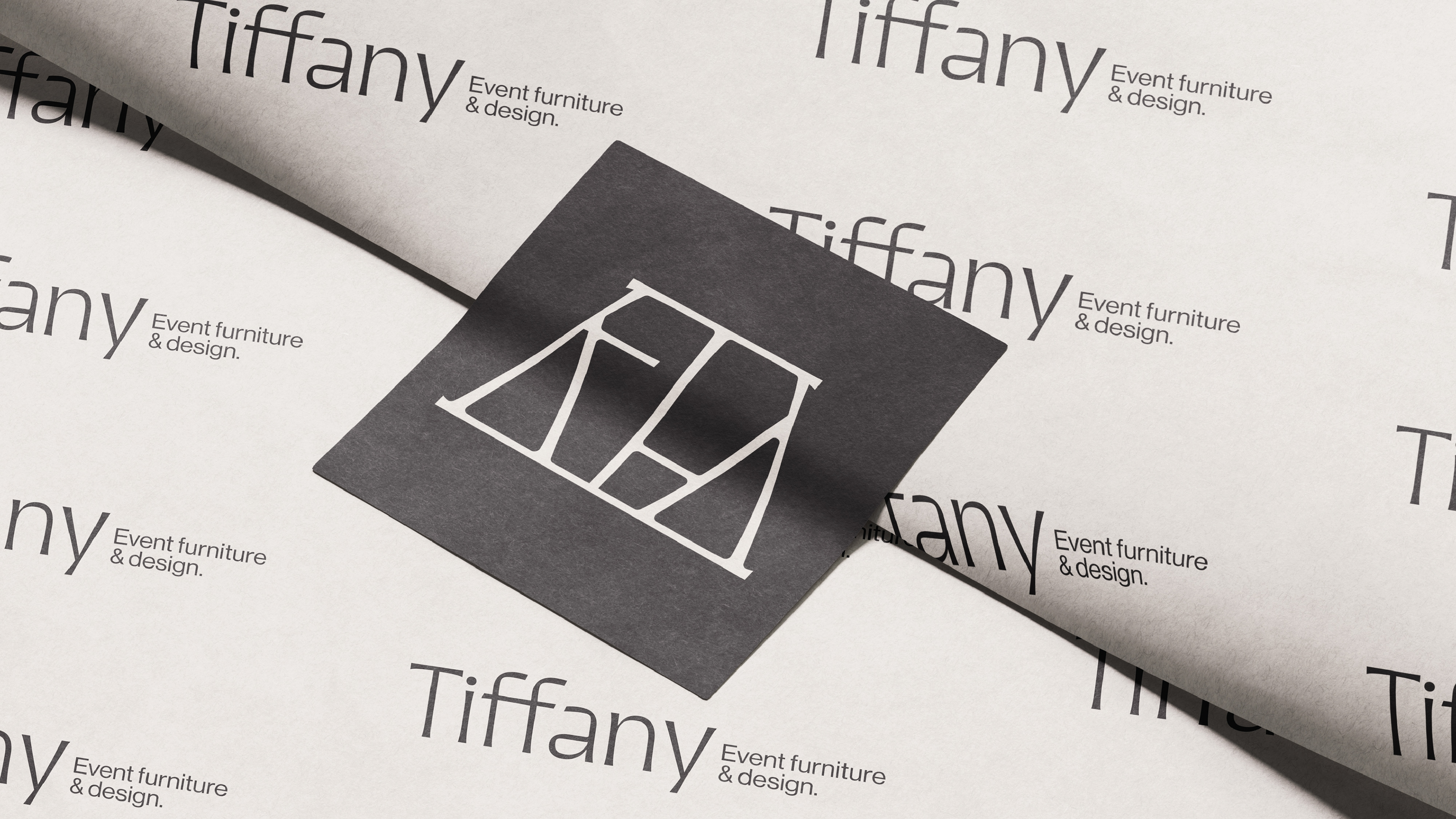
Based on its morphology, curves and diagonals were used as the foundation to build a new identity element. From this process, a monogram emerges, composed of the letters T, F, and Y, adapted from the typeface’s structure. The symbol also incorporates the inverted silhouette of a Tiffany chair backrest as a containing shape.
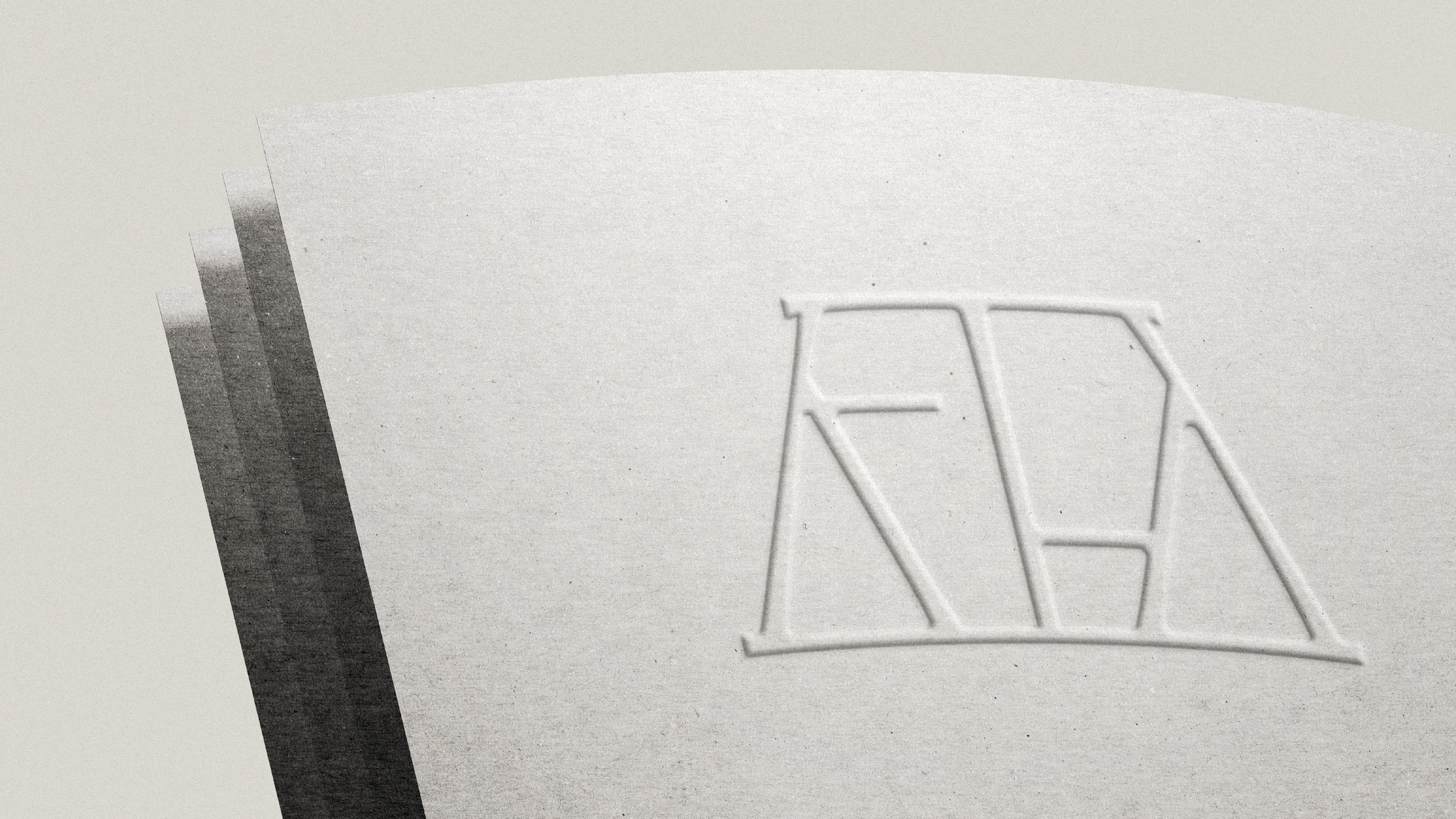
The result is a strong and distinctive mark that synthesizes the brand’s name and visual universe into a single, coherent piece.
Based on its morphology, curves and diagonals were used as the foundation to build a new identity element. From this process, a monogram emerges, composed of the letters T, F, and Y, adapted from the typeface’s structure. The symbol also incorporates the inverted silhouette of a Tiffany chair backrest as a containing shape.
The result is a strong and distinctive mark that synthesizes the brand’s name and visual universe into a single, coherent piece.