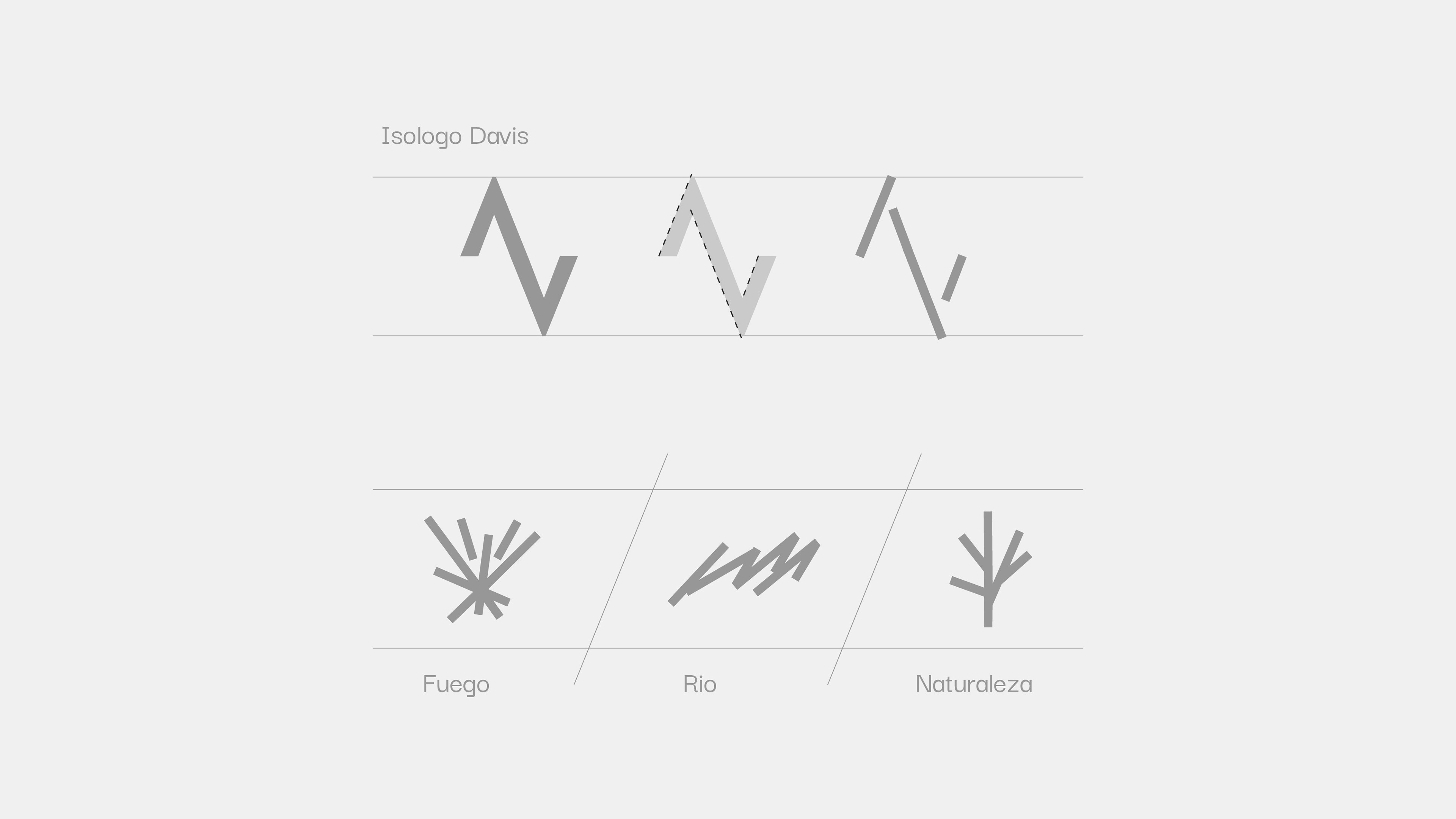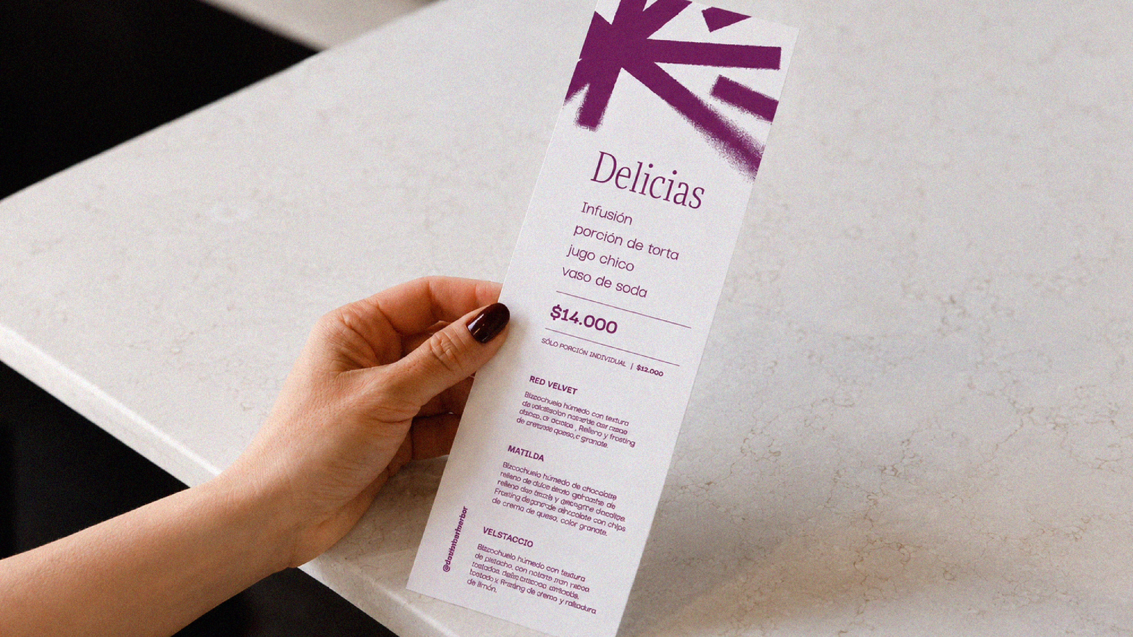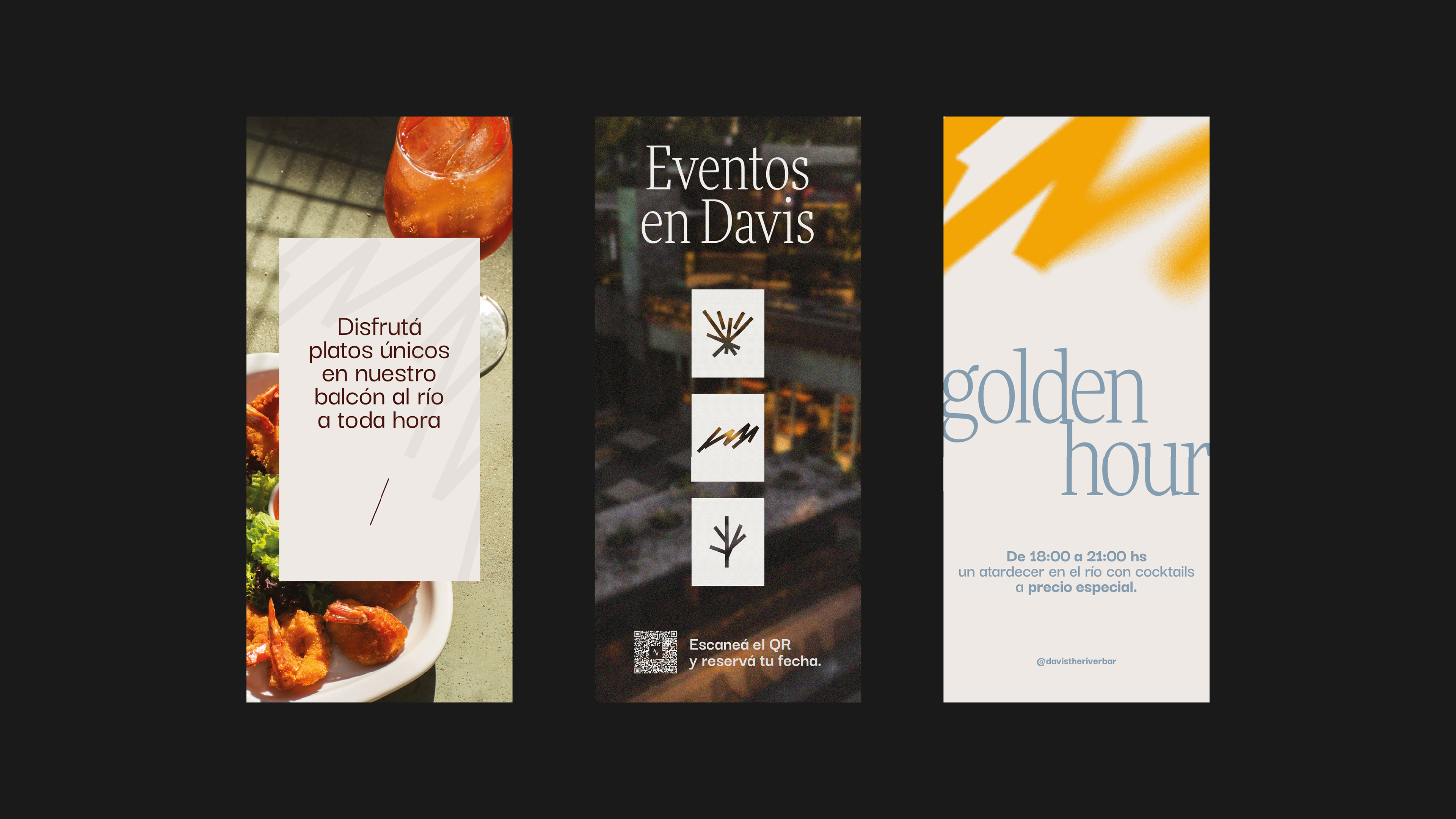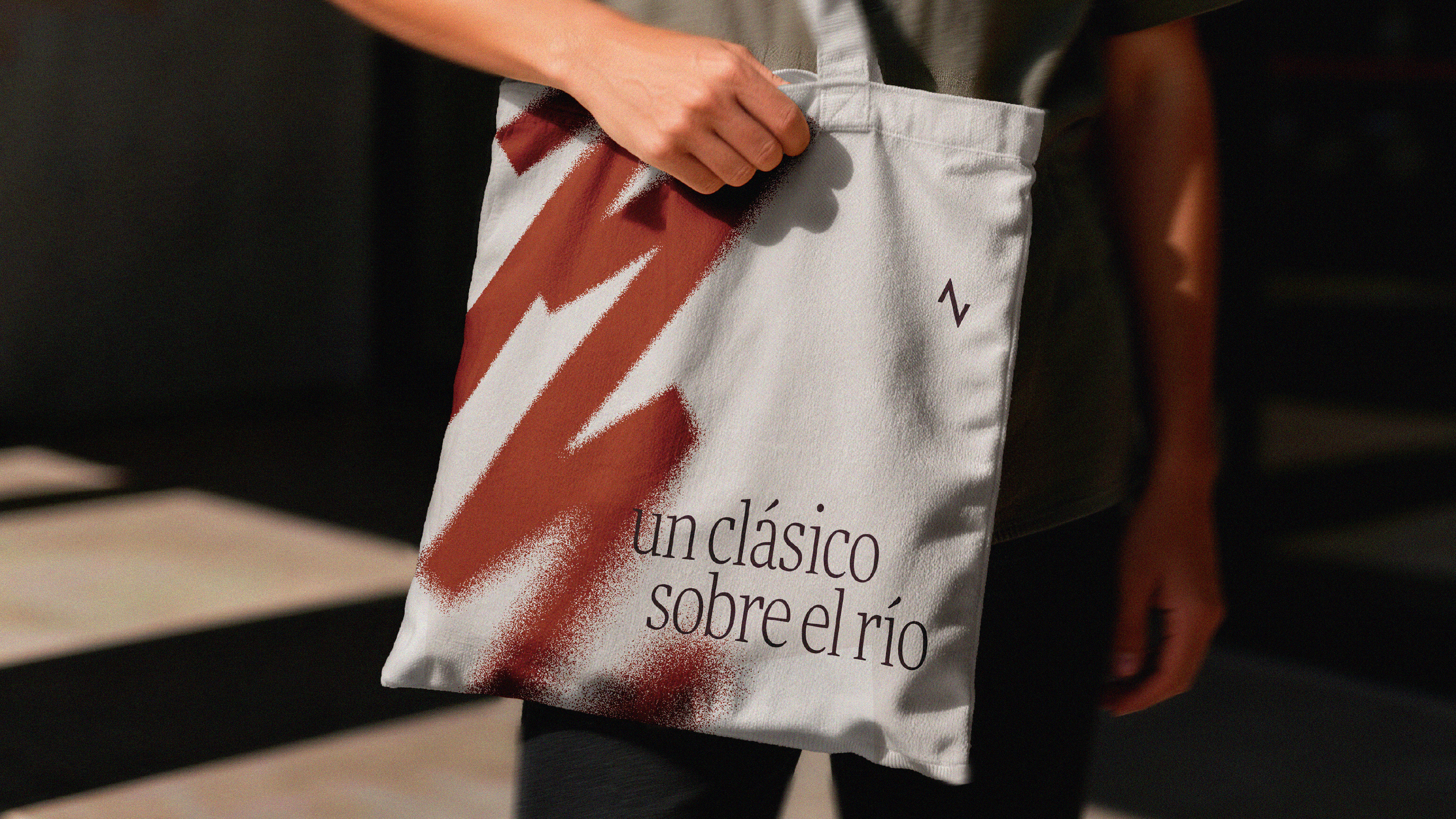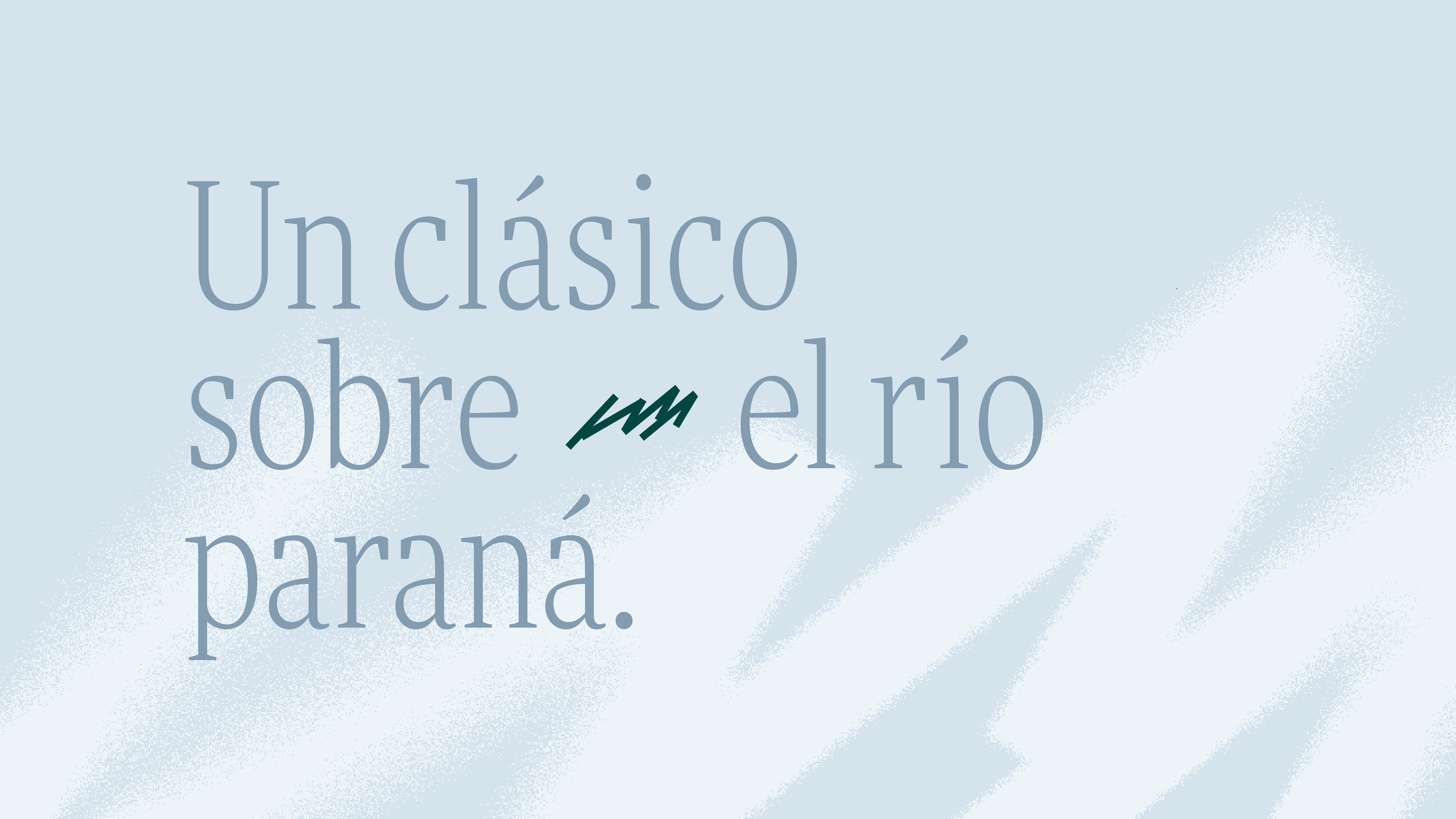
Our starting point was the iconic diagonal shapes of the original Davis logo—a visual element with strong character and recognition that we transformed into an active part of the graphic system. From there, we created a series of new shapes that expand the brand's visual language.
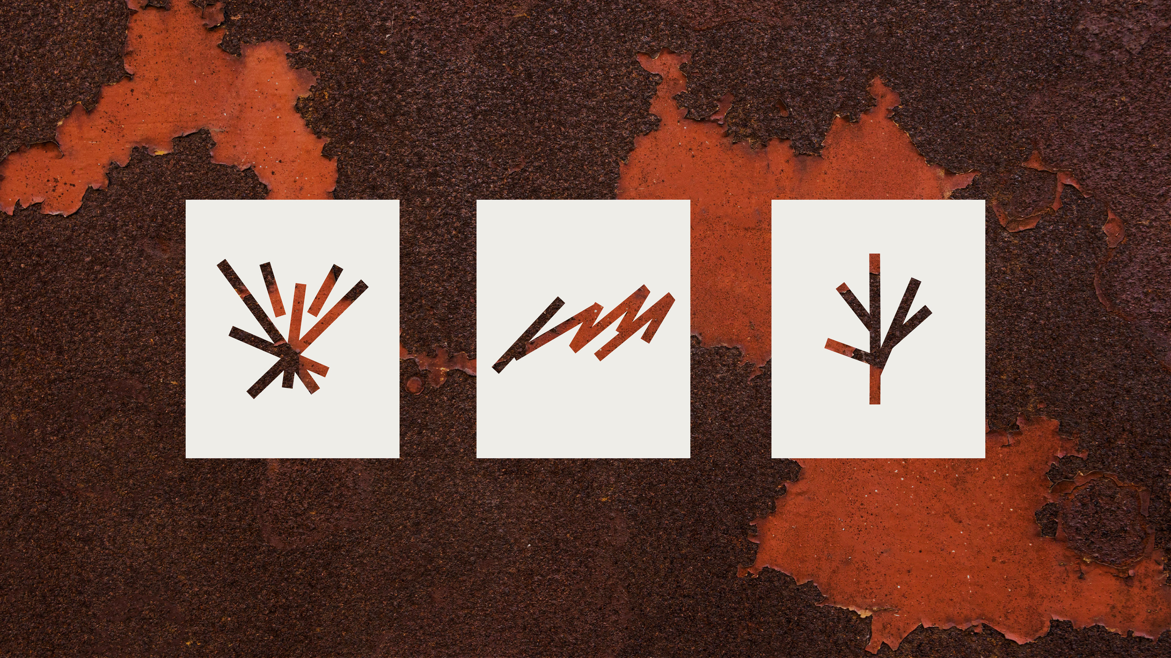
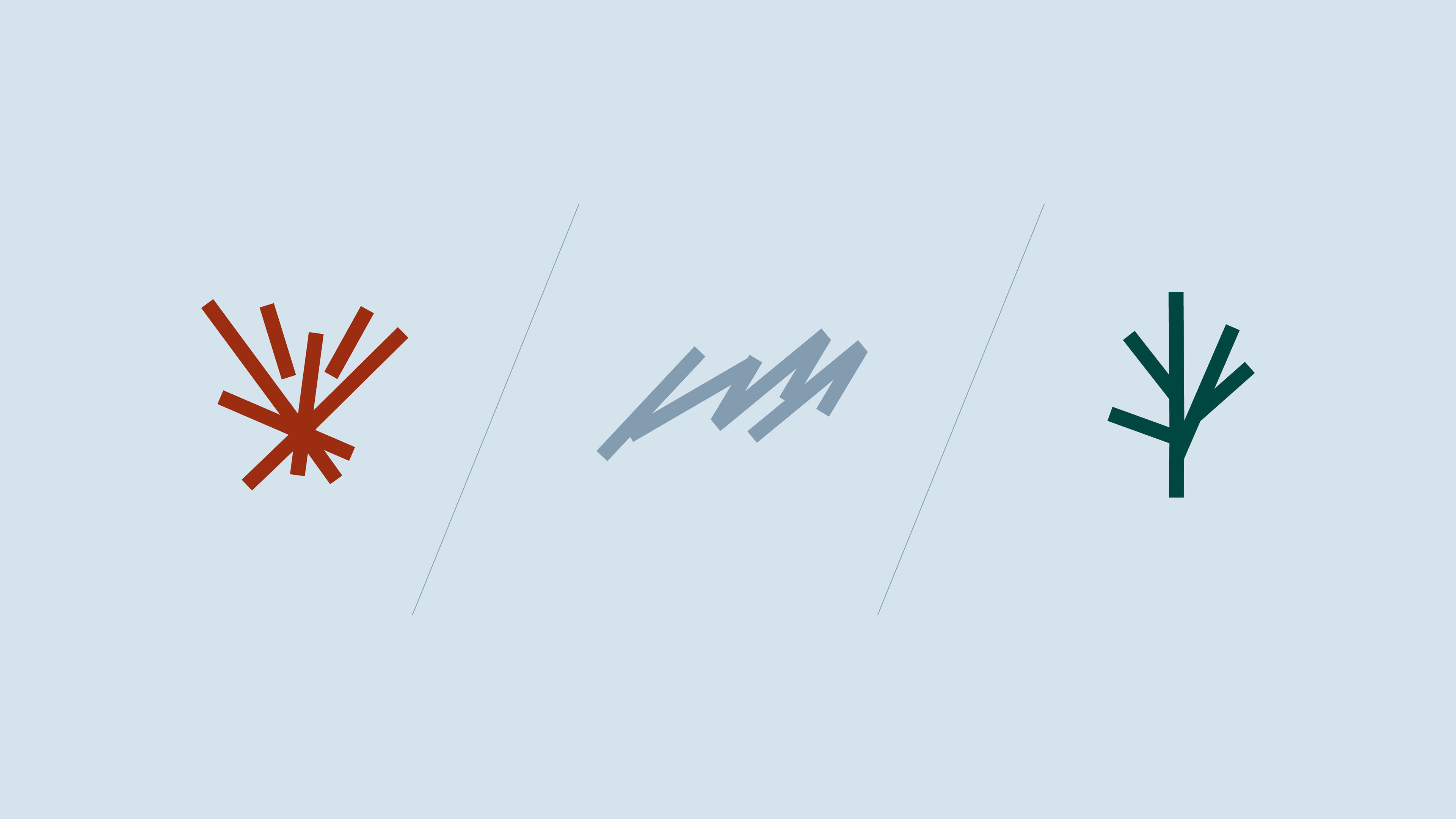
The goal was to represent, through simple and abstract graphics, the three core elements that define Davis: Fire, representing the kitchen, its dishes, and the overall culinary experience. Waves, as a direct reference to the Paraná River and Davis' close connection to Rosario's waterfront. Leaves, symbolizing the natural surroundings that embrace the bar and are an essential part of its identity.
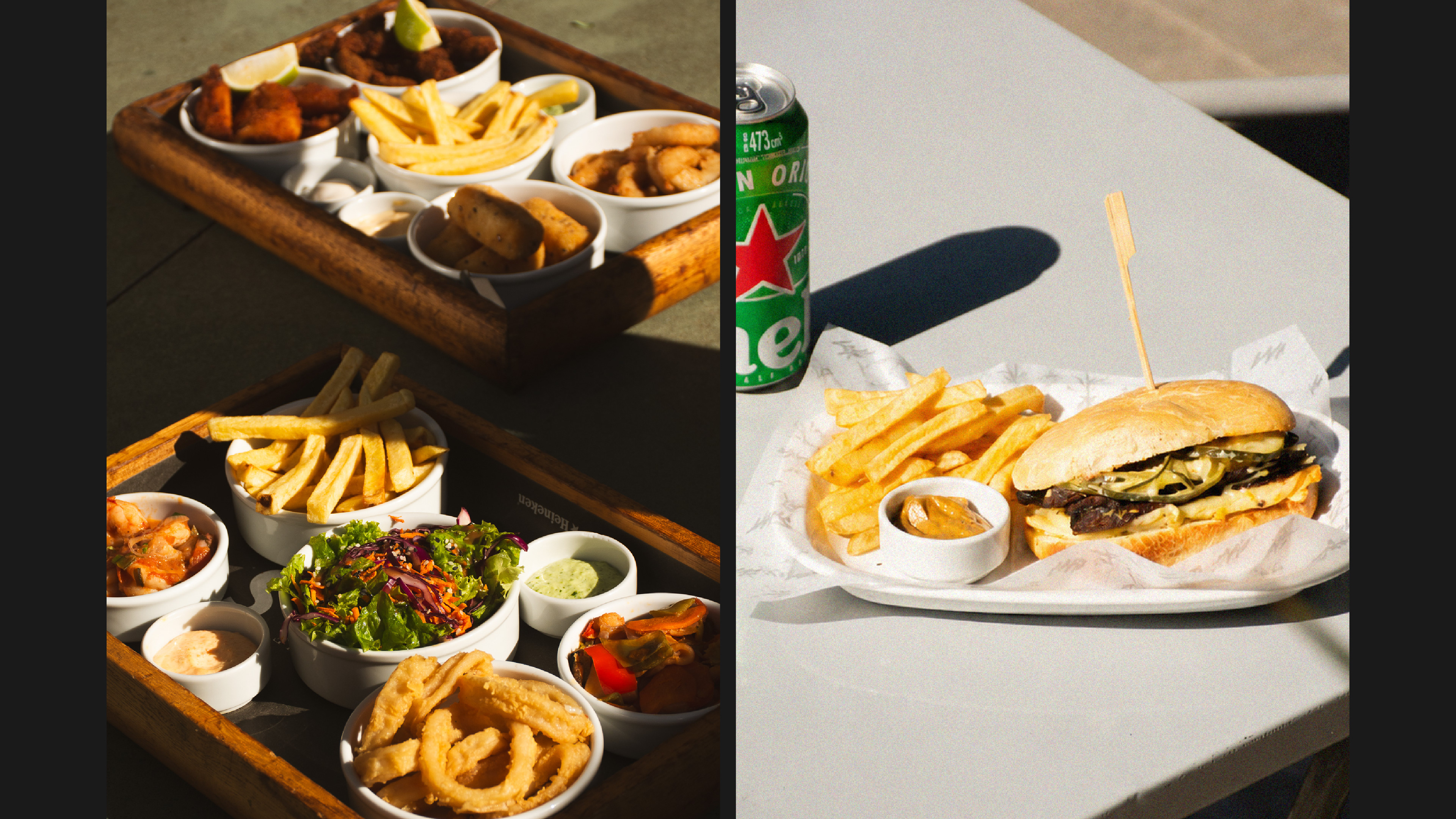
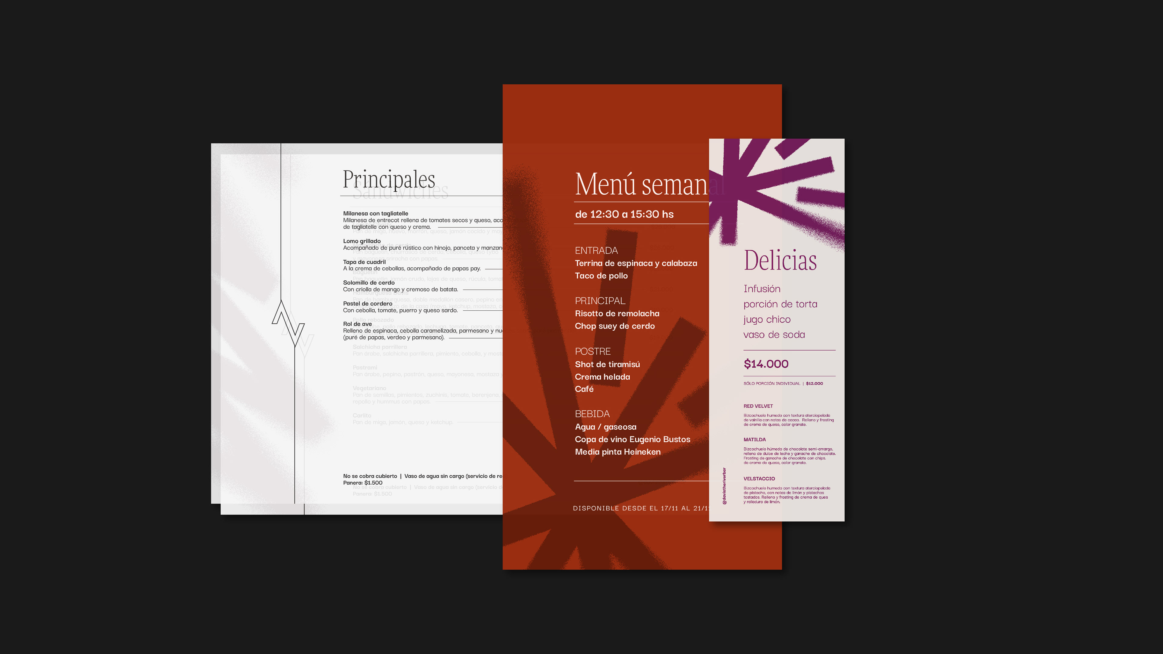
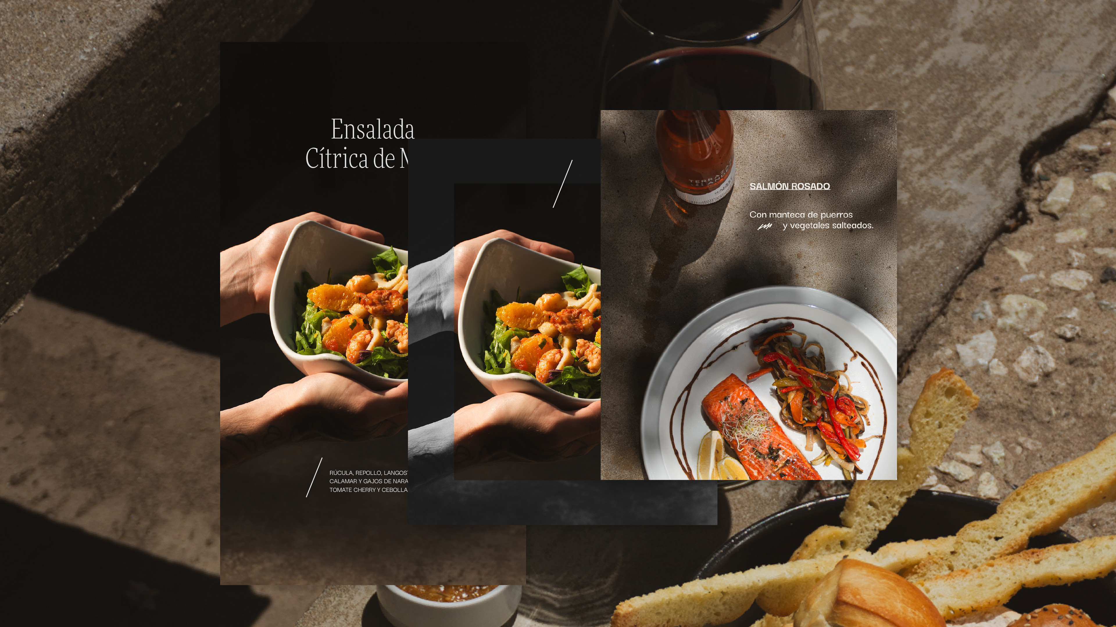
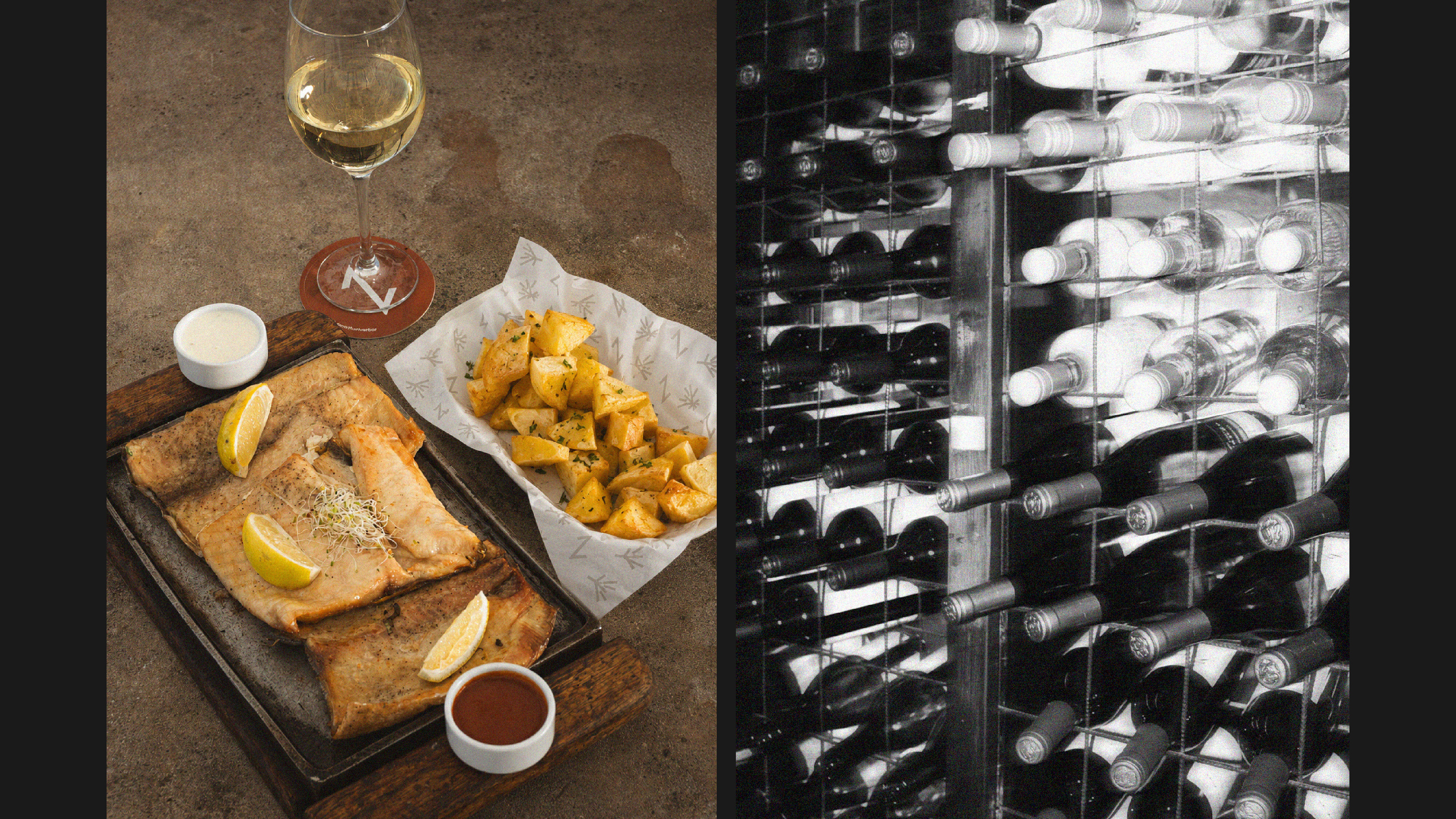
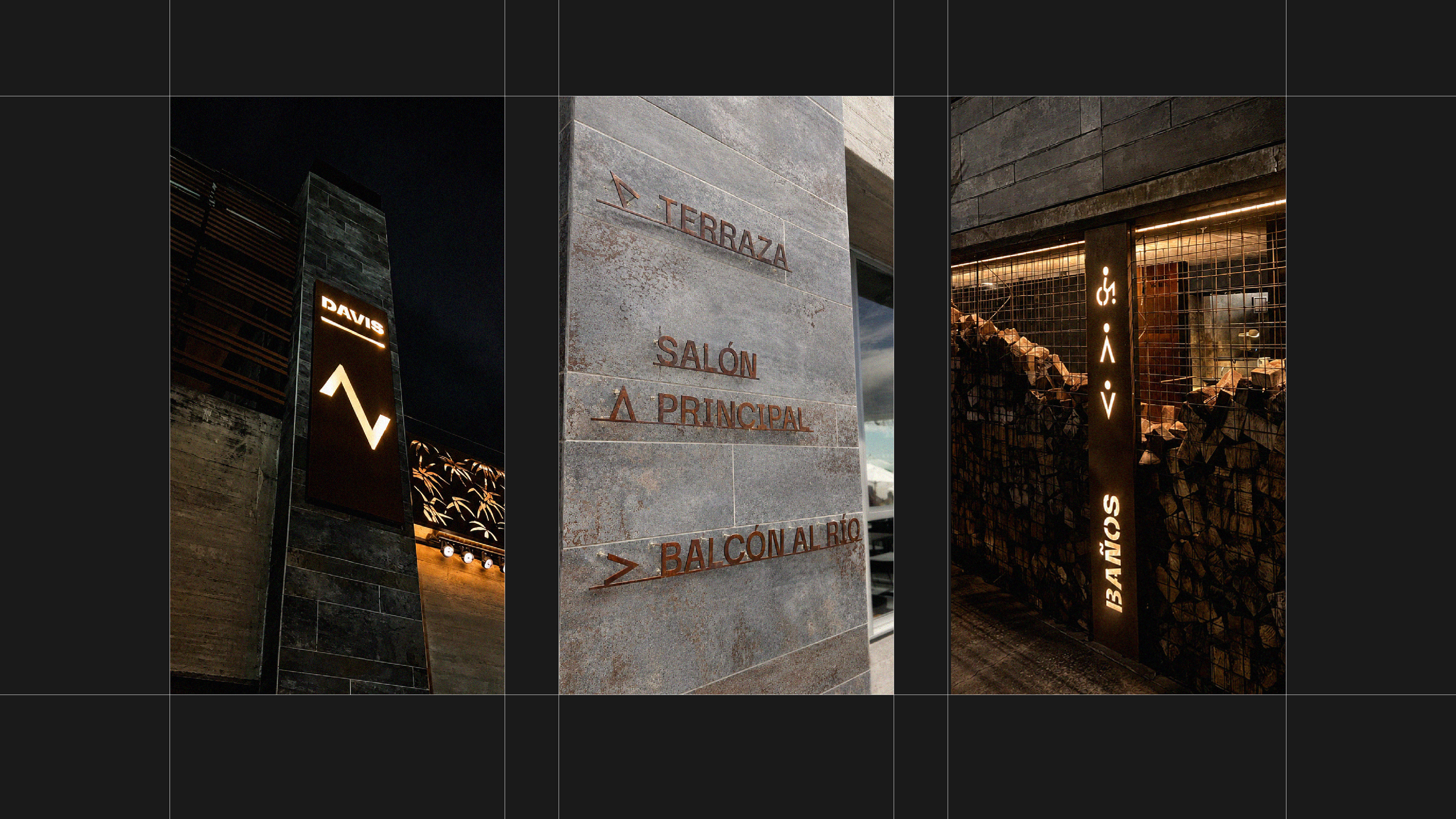
Building on this system, we developed physical applications - including signage, stationery, merchandise, art and creative direction in photography and audiovisual content.